I think that's 72 92 covers, which is a fun bit of uploading when Blooger keeps going demented and losing your uploads halfway through. Thanks again to David Smith!
Wednesday, 8 February 2012
The Covers of Ralph Steadman [Massive Update]
In 2008 I featured a look at some of the many book covers by the great, savage cartoonist Ralph Steadman. Now, thanks to contributions from collector David C Smith, who provuided the bulk of the images below, here is a much bigger selection of Steadman's cover work.
Monday, 6 February 2012
"There's no way they'll ever use it!": An Interview with Dave Shelton
One of the most attractive novels for children that has been published recently, Dave Shelton's A Boy and a Bear in a Boat is also a wonderfully written adventure story, funny and clever and touching. Published in the UK by David Fickling Books, it is also unusual for a children's book in having a deliberately non-commercial cover.
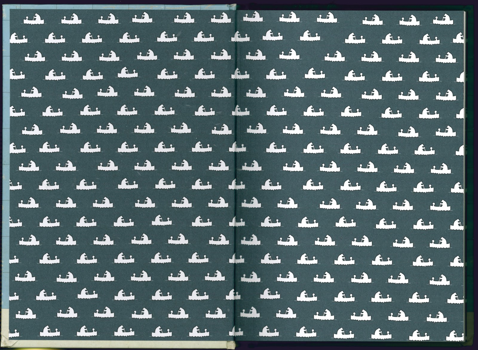
The book is beautifully designed, the cover textured and aged to look like a well-loved, well-read old book; the nearly empty map fly-spotted and stained, the only feature a tiny boat and its two crew, seen from high above.
I've always had a thing for mysterious maps (and I'm not alone--see here, for example), so I love the look of this book. The interior illustrations are marvellous, too--see below for examples. Dave Shelton was kind enough to talk to me about how the cover design and the look of the book came about. (Click all images for much bigger versions)
CAUSTIC COVER CRITIC: I love the cover, but I wondered whether that was an adult's reaction, and how hard it was to get the publisher to agree to such an atypical look for a children's book.
DAVE SHELTON: It wasn't hard at all to convince my publisher, David Fickling, to go with this design. He's a daring fellow. In fact I'd previously shown him maybe as many as a dozen other possible cover designs (mostly very roughly worked out) that were much more conventional in nature and the response was generally along the lines of "well, that's okay but it's not quite right", I think largely because I'd been making assumptions about what was required and what might be allowable.
After several batches of suggestions had been rejected (albeit in a very kindly manner) it was getting to the point where we really needed to decide upon something very soon and I stopped trying to second-guess what I thought David would want and just played around doing something to please myself.
One afternoon I was fooling around and came up with this rough design in a very short space of time.
I showed it to my partner, Pam Smy, who's a brilliant illustrator herself and a lecturer on the subject and whose opinion I value, and the conversation went something like:
Me: This is really good isn't it?
Pam: Yes it is.
Me: There's no way they'll ever use it though is there?
Pam: No, of course not.
Me: But I've got to show it to them anyway, haven't I?
Pam: Yes, of course.
So I emailed it over expecting a response along the lines of "that's all well and good but can we have a serious suggestion now" and instead got a pretty quick reply saying:
> I really like this. Everyone is going to say that it would not appeal to
> children and is too adult but it is hilarious and memorable. It's a very
> special book and this is a special cover.
>
> That's my view.
Which immediately called my bluff and meant I had to go ahead and do it. And from there to the finished cover, working with the book's overall designer, Ness Wood, was, as far as I remember, a remarkably swift and smooth process. There was some back and forth about the text for the back cover but essentially the front is all mine, exactly as I wanted it with no interference from the publisher at all. I was just left to do it my way, which was amazing, really.
So it wasn't really a matter of me being determined to have this design as a cover, it was just one of many ideas and it's the one that struck the right note with David. I think it's a brave choice but I kind of think the bravery is his rather than mine. I'm really proud of the end result and very grateful to have been allowed to do it.
CAUSTIC COVER CRITIC: And what has the reaction been from children, do you know?
DAVE SHELTON: I can tell you what at least some kids think of the cover. There's someone using A Boy and a Bear in a Boat as a starting point for creative activities with primary school kids, and she let me know that they initially thought the cover was "boring, dirty, plain and dull". They were won over by the contents in the end though, I think, and realised there was a bit more to the cover than they'd first realised. I'm really happy with that.
CAUSTIC COVER CRITIC: Do you work entirely in paint, pencils, etc, or do you do any digital touching-up, etc?
DAVE SHELTON: My usual method is that I work in fibre-tip pen on paper, scan that in and then colour in Photoshop. The interior illustrations for A Boy and a Bear in a Boat are a bit more varied than that, though, with a fair amount of them drawn in pen and brushpen as proper originals and scanned straight in.
There was a certain amount of digital jiggery-pokery in some of the larger illustrations to combine different drawings or add in scanned textures, or just to correct my more dreadful mistakes.
The cover was something else again as it's pretty much a purely digital production. The tea stain had already been scanned for an interior illustration so I recycled that, the grid was done in Illustrator, an old paper texture was dropped over a flat blue for the base colour and I scanned the knackered dustcover of a book of Pam's to get the creases to drop onto the end result. Oh and I scanned in a squished fruitfly (which looked really scary at high resolution) and some biscuit crumbs.
CAUSTIC COVER CRITIC: Are you able to use the UK cover on overseas editions?
DAVE SHELTON: The US edition, which comes out in June, has a different cover,at the request of Random House US. This was worked up from one of the previous roughs that David Fickling didn't go for.
I'm pleased with how it turned out but it's much more a case of me doing the illustration and handing it over to the US designer, Sara Hokansen, rather than taking hold of the whole thing.
CAUSTIC COVER CRITIC: Thank you, Mr Shelton!
Dave Shelton is also the creator, writer and artist of Good Dog, Bad Dog, a comic strip series about a pair of dog detectives in a world of canine crime, the first collected volume of which is also published by David Fickling.
The book is beautifully designed, the cover textured and aged to look like a well-loved, well-read old book; the nearly empty map fly-spotted and stained, the only feature a tiny boat and its two crew, seen from high above.
I've always had a thing for mysterious maps (and I'm not alone--see here, for example), so I love the look of this book. The interior illustrations are marvellous, too--see below for examples. Dave Shelton was kind enough to talk to me about how the cover design and the look of the book came about. (Click all images for much bigger versions)
CAUSTIC COVER CRITIC: I love the cover, but I wondered whether that was an adult's reaction, and how hard it was to get the publisher to agree to such an atypical look for a children's book.
DAVE SHELTON: It wasn't hard at all to convince my publisher, David Fickling, to go with this design. He's a daring fellow. In fact I'd previously shown him maybe as many as a dozen other possible cover designs (mostly very roughly worked out) that were much more conventional in nature and the response was generally along the lines of "well, that's okay but it's not quite right", I think largely because I'd been making assumptions about what was required and what might be allowable.
After several batches of suggestions had been rejected (albeit in a very kindly manner) it was getting to the point where we really needed to decide upon something very soon and I stopped trying to second-guess what I thought David would want and just played around doing something to please myself.
One afternoon I was fooling around and came up with this rough design in a very short space of time.
I showed it to my partner, Pam Smy, who's a brilliant illustrator herself and a lecturer on the subject and whose opinion I value, and the conversation went something like:
Me: This is really good isn't it?
Pam: Yes it is.
Me: There's no way they'll ever use it though is there?
Pam: No, of course not.
Me: But I've got to show it to them anyway, haven't I?
Pam: Yes, of course.
So I emailed it over expecting a response along the lines of "that's all well and good but can we have a serious suggestion now" and instead got a pretty quick reply saying:
> I really like this. Everyone is going to say that it would not appeal to
> children and is too adult but it is hilarious and memorable. It's a very
> special book and this is a special cover.
>
> That's my view.
Which immediately called my bluff and meant I had to go ahead and do it. And from there to the finished cover, working with the book's overall designer, Ness Wood, was, as far as I remember, a remarkably swift and smooth process. There was some back and forth about the text for the back cover but essentially the front is all mine, exactly as I wanted it with no interference from the publisher at all. I was just left to do it my way, which was amazing, really.
So it wasn't really a matter of me being determined to have this design as a cover, it was just one of many ideas and it's the one that struck the right note with David. I think it's a brave choice but I kind of think the bravery is his rather than mine. I'm really proud of the end result and very grateful to have been allowed to do it.
CAUSTIC COVER CRITIC: And what has the reaction been from children, do you know?
DAVE SHELTON: I can tell you what at least some kids think of the cover. There's someone using A Boy and a Bear in a Boat as a starting point for creative activities with primary school kids, and she let me know that they initially thought the cover was "boring, dirty, plain and dull". They were won over by the contents in the end though, I think, and realised there was a bit more to the cover than they'd first realised. I'm really happy with that.
CAUSTIC COVER CRITIC: Do you work entirely in paint, pencils, etc, or do you do any digital touching-up, etc?
DAVE SHELTON: My usual method is that I work in fibre-tip pen on paper, scan that in and then colour in Photoshop. The interior illustrations for A Boy and a Bear in a Boat are a bit more varied than that, though, with a fair amount of them drawn in pen and brushpen as proper originals and scanned straight in.
There was a certain amount of digital jiggery-pokery in some of the larger illustrations to combine different drawings or add in scanned textures, or just to correct my more dreadful mistakes.
The cover was something else again as it's pretty much a purely digital production. The tea stain had already been scanned for an interior illustration so I recycled that, the grid was done in Illustrator, an old paper texture was dropped over a flat blue for the base colour and I scanned the knackered dustcover of a book of Pam's to get the creases to drop onto the end result. Oh and I scanned in a squished fruitfly (which looked really scary at high resolution) and some biscuit crumbs.
CAUSTIC COVER CRITIC: Are you able to use the UK cover on overseas editions?
DAVE SHELTON: The US edition, which comes out in June, has a different cover,at the request of Random House US. This was worked up from one of the previous roughs that David Fickling didn't go for.
I'm pleased with how it turned out but it's much more a case of me doing the illustration and handing it over to the US designer, Sara Hokansen, rather than taking hold of the whole thing.
CAUSTIC COVER CRITIC: Thank you, Mr Shelton!
Dave Shelton is also the creator, writer and artist of Good Dog, Bad Dog, a comic strip series about a pair of dog detectives in a world of canine crime, the first collected volume of which is also published by David Fickling.
Thursday, 2 February 2012
Lew Archer: New, Newish and Old
The Lew Archer novels of Ross Macdonald are some of the best private-eye novels written, forming a sort of gumshoe Holy Trinity with Hammett and Chandler. Penguin UK have snaffled some of them for their Modern Classics range (to go with some other surprising but welcome crime-writing additions to that series), and have employed Edward Bettison to do the cover designs, with more than a hint of a stylish late-'50s, early-'60s vibe.
It's a pity the excellent Black Money isn't part of the set.
I'm also rather partial to the current US covers for the Archer books, put out by Vintage US/Black Lizard, which do a great job of playing up the noir aspects of their atmosphere.
All of these are quite a step away from the skin/boob-tastic covers inflicted on the books by Fontana at the tail end of the 1970s.
That last cover troubles me: is the target trapped under a breast? Between the cheeks of an incredibly lopsided arse? Clutched under a bingo wing?
It's a pity the excellent Black Money isn't part of the set.
I'm also rather partial to the current US covers for the Archer books, put out by Vintage US/Black Lizard, which do a great job of playing up the noir aspects of their atmosphere.
All of these are quite a step away from the skin/boob-tastic covers inflicted on the books by Fontana at the tail end of the 1970s.
That last cover troubles me: is the target trapped under a breast? Between the cheeks of an incredibly lopsided arse? Clutched under a bingo wing?
Labels:
Black and white,
Edward Bettison,
Fontana,
Penguin,
Vintage
Wednesday, 1 February 2012
Tapping
Not much to say about this one, other than it's really nice: simple, striking and spot-on. From Pantheon in the US, designer as yet unknown: is Paul Sahre. The bottom image is stolen from Peter Mendelsund's blog, where he talks more about the design.
![]() |
| Thomas Mallon: Watergate |
Big Hair
[Sorry about the long gap between posts: among other things, I managed to injure myself while putting in a new hot water system, and my wife managed to injure herself while cooking, so it's been Uncoordinated Self-Inflicted Iinjury Fortnight at our place.]
I've never read George Pelecanos--he's one of those writers I keep heariung great things about, but have never got around to. However, now seems a good time to start: his UK publisher, Orion, is doing a three-version launch of his most recent book, What It Was, which is probably a test in how to make money in the new digital publishing world. They're simultaneously doing an ultra-cheap ebook, a normal paperback, and a fancy-pants (but not over-expensive) hardcover. And it has worked on me, since I've now ordered the hardcover.
The novel is set in 1972, and the book has a full-on blaxsploitation look. I can find no info on the designer anywhere, sadly. Here's the hardcover:
And the paperback:
Both are much more interesting than the US edition:
I've never read George Pelecanos--he's one of those writers I keep heariung great things about, but have never got around to. However, now seems a good time to start: his UK publisher, Orion, is doing a three-version launch of his most recent book, What It Was, which is probably a test in how to make money in the new digital publishing world. They're simultaneously doing an ultra-cheap ebook, a normal paperback, and a fancy-pants (but not over-expensive) hardcover. And it has worked on me, since I've now ordered the hardcover.
The novel is set in 1972, and the book has a full-on blaxsploitation look. I can find no info on the designer anywhere, sadly. Here's the hardcover:
And the paperback:
Both are much more interesting than the US edition:
Subscribe to:
Posts (Atom)