..the latter image being the same as that used on this wonderful book (see the original post for more information).
Tuesday, 23 February 2010
The Bob and the Books (Part II)
Continuing the attempt to catalogue every apearance of Louise Brooks on a book cover (started here)...
Monday, 22 February 2010
The Human Comedy of the Publishing World: An Interview with Charles Boyle
This interview is a little different to the others, in that the man being interviewed doesn't just design the look of the books: he commissions, edits, publishes and promotes them himself, too.
Charles Boyle worked for 14 years at Faber (back-room copy-editing and production), then quit five years ago and started the small press CB Editions in 2007. He produces four books a year. So far, CBe has won a couple of prizes and a couple of shortlistings, as well as having its second book, 24 for 3 by Jennie Walker, snapped up by Bloomsbury.
When I asked Charles if he would mind being interviewed, he said, “I'll try not to rabbit on; the idiocies of the publishing world are manifold. Stay in there, an agent once told me when I was trying to get out of it, for the human comedy.”
CAUSTIC COVER CRITIC: The typographic covers really work for me--an example of budget limitations becoming a virtue. Could you talk a bit more about how the books came to look like this?
CHARLES BOYLE: Money reasons first, yes: I’m familiar with handling text but not images in the relevant software programs, and going typographic meant I didn’t have to pay an outside designer. But other things add in. The manila board covers are an imitative homage to Alan Ross’s London Magazine Editions of the late 1960s and 70s, the paperback series (designed by Ron Costley, who later became text designer at Faber).
Some of the early London Magazine Editions
Apart from the first four, all the books have coloured endpapers.
And the spartan, indeed puritan, look is a way of marking out the books from the general run of mainstream publishing, with whom I am not in competition: the books have their place, but it’s not on the 3-for-2 table at Waterstone’s.
Of course the other economy of typographic covers is this: it bypasses the traditional and often bitter arguments between author and publisher over the cover. Time-consuming and expensive. Unless you're going with a good and trusted designer and giving them their head, so much depends on the quality of the brief and the feedback on the roughs, a skill that's barely recognised.
CCC: The cover for Knight Crew is full colour and illustrative: is this a one-off because of the target audience of young adults, or do you foresee more covers like this?
Though actually another one-off, with colour cover, in May: a book of short stories (for adults) by an 80-something-year-old author who used to write children’s books in the 60s and 70s. Again potentially more commercial appeal than the other titles; again her agent couldn’t place it. I got to know and like the author and promised to help her self-publish, then realised I also liked the stories very much and if I was spending so much time on the book I might as well bring it into the fold. But both these books are the exceptions; even if they are commercially successful, I’m not set up to deliver on that in the way that larger places are.
CCC: I suspect you must be a bit of a type enthusiast. The presence of ligatures in the Grabinski was a delight to me (I love and miss ligatures!). How do you decide on what type to use for the covers and the innards?
CHARLES BOYLE: Enthusiast maybe, but an amateur one. At Faber (where I worked in back-room jobs for 14 years) we worked with a very limited range of fonts and many of the books were flowed into templates rather than individually designed: now I’ve been let out of school I’m learning how to play.
I’m naturally impatient, but on the other hand I can geekily play around with typefaces for days. As soon as—on occasion even before—I’ve taken a book on I start playing around with sample text and the cover: I don’t feel it’s a CBe book until I’ve got some kind of fix on how it will look. And the type has to match my take on the character of the book itself (a tiny, obvious example: the Ponge cover had got to have roundest of O’s).
CHARLES BOYLE: My own writing history, until very recently, is in poetry (I’ve published with Carcanet and Faber), but there are a number of small presses around doing exclusively poetry. And my reading is mostly fiction. Alan Ross’s London Magazine Editions was the model here, too: as well as good writing across a range of genres, he liked horse-racing, cricket, art, travel, the good life, and his list reflected his interests. (Cape Editions, edited by Nathaniel Tarn from 1967, small format and typographic covers, also had this eclecticism.)
I’m attracted to custom-made rather than off-the-peg forms: sequences, stories told in verse, books that combine images with text, rather than straightforward beginning-middle-and-end fiction. And to short, concentrated books rather than long ones. The more material that I get sent, the more ‘making the cut’ comes down to this: I have to like the work not just in the sense of admiring it and recognising it as publishable, but to the point where I’d go to the wall for it and not worry too much about the money.
CCC: At a time when you might expect people considering small-press publishing would wait for the economy to boom a bit, a number of interesting and enterprising publishers like yourself, Capuchin, Myna, etc, have emerged, none pursuing the obvious commercial hits that bigger firms bank on. If it's not too indelicate question, how do you make it pay?
CHARLES BOYLE: OK, money. First, I’m continually surprised by what you can get done for small amounts of it. Last year I paid £200 for UK
Very round figures, but the above means that if I sell 200 copies of a title with £5 coming in for each sale (a bit less from shop sales, a bit more from online sales), I break even. More than that and I’ve money to play with.
200 is not a large number, but it’s still bloody difficult. (One of the mistakes I’ve made along the way was to assume at the start that because I knew a number of folk in publishing, they’d be supportive and buy; I’d forgotten that no one in the media expects to pay for books.) A book by an unknown writer from an unknown imprint is simply not going to get media attention (and if no one knows it’s there, does the book even exist?). But I’m getting there (not least, of course, because one or two of the writers I now publish are not unknown). The first year I came out on top, just; the second year I lost a chunk of money; for the current financial year I’m not going to do the figures until end of March, but it’s looking a whole lot better.
In conventional terms, if I’m not costing my own work against the books, and then selling more than enough to cover those costs, I’m not ‘making it pay’ at all, nor is this any kind of recognisable business model. What it is – and I’m by no means the only small publisher operating like like this – is publishing as vocation, not job. (Writers starve, why shouldn’t publishers?) Not wholly unlike the old idea of the ‘gentleman publisher’ with a private income. Made possible now for me, hardly a gentleman, by low-cost short-run digital printing and by the bread-on-table day-to-day income I draw in from freelance editing and typesetting for mainstream publishers.
In practice, the more time I spend on CBe, the less time I spend on the freelance hackwork, so there’s a financial gap, a credibility one too, that needs managing. The aim is to reach a level, a balance – the equation for which involves both figures (sales, expenses, number of titles) and luck – that’s sustainable.
CCC: Are there any books you'd love to publish, but the rights or translations have proved too elusive?
CHARLES BOYLE: There are occasional agents or permissions bureaucracies that simply don’t respond. But in general, no. Mainstream publishers, alongside the celebrity stuff they are mocked for, publish many fine writers and publish them well, much better than I could, and I am not in competition with them. I’m here for the more oddball books that don’t fit conveniently in their lists, and the field is open.
CCC: Thank you, Mr Boyle!
Wednesday, 17 February 2010
Floc'h!
More here, at a blog dedicated to rounding up his work, from where a lot of the above images originated.
Tuesday, 16 February 2010
Triple-Deckers Return
In the Victorian era, big (and even not so big) novels were routinely broken up into three volumes by the publishers. There was a simple reason for this: pressure from libraries. At the time, libraries were a commercial proposition, and you paid for each book you borrowed. This meant that to read a whole book, you needed to pay three subscriptions, which is why the libraries liked the triple-decker format, and why they pressured publishers into continuing with it.
Since then, of course, big books have usually been published as single volumes, except in the fantasy and science-fiction genres. But the decision in 2008 to publish 2666 as three volumes in a slipcase was a welcome bit of nostalgia: you paid the same as for a single book, but you got a beautiful set of books in an attractive case.
Hamish Hamilton in the UK seem to have been inspired by this: they have just published Paul Murray's Skippy Dies in a similar format. I've only just got my copy, so I can't tell you yet whether the structure of the book suits the format as well as 2666 did, but it's an undeniably attractive bit of design, with artwork by Leanne Shapton.
Shapton has also recently published a book of her own--a novel in the form of an auction catalogue, consisting of possessions going under the hammer after the end of a relationship--called Important Artifacts and Personal Property from the Collection of Lenore Doolan and Harold Morris, Including Books, Street Fashion, and Jewelry...
..as well as providing lettering and design elements for a number of other book covers in the US.
Sunday, 14 February 2010
To Convey an Idea Concisely, with as Little Fluff as Possible: An Interview with Michael Salu
Having recently posted the beautiful type-dominated covers for Vintage Classics' Italo Calvino and Raymond Carver reissues, I had to interview the man responsible, Michael Salu. He was kind enough to agree, so here we go... (and remember to visit his site, With Subtitle, which has mountains more beautiful design work)
* * *
CAUSTIC COVER CRITIC: What's your design background? How did you get into book design?
MICHAEL SALU: Teenage obstinacy led me to snub a burgeoning literary ability (lauded by my teachers at the time), and embark on a career in art and design. I eventually gained a degree in Graphic Communication, which had a quite varied curriculum, helping to articulate my inclination for more lateral thought. I had influential tutors who exposed me both to the fundamentals of typography and how to be an unemployable socialist.
CCC: Are you on staff at Random House/Vintage, or are you a freelancer?
MICHAEL SALU: I used to work for the literary division of the Random House Group. I've now moved on to be Artistic Director of Granta magazine. It was quite rewarding working specifically for the literary division as I often worked on books I had a personal interest in, allowing me to maintain a design-led approach. 'Design-led' might appear to be an odd thing to say, but vast swathes of the UK publishing industry, have a tendency to overlook this.
CCC: What are some recent covers of which you're most proud? What about older work?
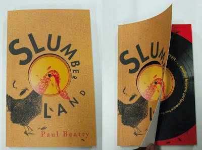
MICHAEL SALU: Actually a lot of my favourite covers had limited exposure, a consequence of small print runs and distribution territory. I particularly enjoyed working with the Harvill imprint. One such cover was for Slumberland by Paul Beatty, which featured a 12inch-like die cut and a GDR influenced aesthetic.
Vintage Classics allowed me a lot of freedom. I was quite pleased with the Raymond Carver series, as I tried to capture Carver's paired down aesthetic with a minimal treatment of the gorgeous Bodoni typeface. The Marcel Proust covers--also for Vintage Classics--were quite successful. Proust's writing is intricate, delicately woven but above all romantic. Penny Cottee's photographs encapsulated the metaphor beautifully.
The Bruce Chatwin series I designed a couple of years ago was a particular favourite of mine. I'm still surprised I got away with it. Horizontal lines playing at landscapes and atmosphere...
CCC: How much do you work with a computer, as opposed to old-fashioned ink/paint on paper? And with images like your Tricky portrait (shapes cut from plywood(?), photographed with real smoke behind it), is the pressure or temptation there to do it quickly in Photoshop, rather than making and photographing a real, physical object?
MICHAEL SALU: This is something I'm particularly vehement about. Bizarrely, designers looking for employment are often judged by what software they're able to use. Intellect, cultural awareness and often creativity don't seem to be values worthy of a resume. There is no substitute for good ideas, the rest are just supportive tools. I have always been quite a craft-led designer, but I am of the generation that studied with a mac in front of them and I think its good to understand the importance of both. The 'Maxinquaye' artwork was a good example. I probably could have mimicked smoke in Photoshop, but regardless of any pen tool dexterity, it would still have looked obviously computer generated. Getting my hands dirty with help from a hot kettle, plywood, spray paint, cigarette smoke, daylight and my good friend, photographer Giles Jenkyn, made for a much more authentic solution. The mercurial nature of light and smoke can't really be replicated...
The album image (above) and the studio set-up to create it (below)
CCC: Is it a hard sell to get a type-only cover accepted by a publisher?
MICHAEL SALU: Yes. Particularly with the publishing industry under immense pressure, in a bid to cope with 21st century's democratisation of information. To Random House's credit, they often agreed to type-only suggestions if narrative or concept were explicit enough. I love immediacy in design. To convey an idea concisely, with as little fluff as possible is quite pleasurable.
CCC: Your Highsmith covers fit nicely with Nathan Burton's Highsmiths for Bloomsbury--was this deliberate?
MICHAEL SALU: Not particularly, more coincidental than anything else. Sometimes deconstructing the brief from an editor can be a challenge in itself, particularly if they request something Saul Bass-esque. You can probably imagine the chorus of groans. Hmm… how can we do something reasonably interesting with a nod to one of the most iconic and influential designers of our time? Myself and fellow designer Liam Relph worked on this series together. The approach was inevitably Bass-influenced, but Liam and I are both keen on narrative illustration anyway. The covers were all hand drawn with double-hit pantone colours on uncoated paper.
CCC: If you could design, inside and out, without budget limitations, any book from the history of literature, what would it be?
MICHAEL SALU: I've been lucky enough to work on some of my favourite books like The Brothers Kamarazov, and a selection of Kurt Vonnegut's books (albeit with very limited budget), but if offered such an opportunity I would love to design Dante's Inferno. Imagine what could be done with the Nine Circles of Hell if money was no object!
CCC: Is there any neglected book you'd love to draw to people's attention as something they should seek out?
MICHAEL SALU: There's a long neglected book you may vaguely recall, called The Bible. I'm not religious but it does make a good read, although I'm not sure its still in print. Alternatively I was introduced to Lost Illusions by Honore De Balzac a while ago and it is a true (and still hugely relevant) classic.
CCC: Thank you, Mr Salu!
Labels:
interview,
Liam Relph,
Michael Salu,
Penny Cottee,
Vintage
Subscribe to:
Comments (Atom)


.jpg)


.jpg)


.jpg)


.jpg)
.jpg)


