Thursday 30 August 2012

Cloudy

There are these things called word clouds, which are various graphical representations of the concordance of a text. For example, here's one for this very blog, in the shape of a dog (click for a readable version).


Somebody (Thunder Bay Press/Canterbury Classics) has hit on the idea of using these to make the covers for their Word Cloud Classics reprints. Each book has significant words and phrases lifted out and arranged in the covers. It's a simple idea, and done quite nicely. I'm not sure they're my cup of tea, but they look quite appealing.


Tuesday 28 August 2012

Books vs Keira Knightley Part IV

With the imminent release of the latest movie version of Anna Karenina, it's time to update the ever-growing Keira Knightley library...


The Woman is Orange (and Lenticular)

When Julian Schnabel's movie biopic of Jean-Michel Basquiat was released, art critic Robert Hughes memorably described it as “a film about our worst dead artist, made by our worst living one.”

When I see this new production from Taschen, a collection of photos by Mario Testino with a lenticular picture of Lady Gaga on the front, it is the collision of the most overrated living photographer with the most overrated living pop singer that is striking.


I can't imagine who would want such a horrible object in their house. The book looks pretty vile, too. (Boom-tish!)

(By the way, anyone who has recently suffered massive head trauma can buy a special edition of this book, in a plastic injection-moulded box, for the princely sum of £450.)

I Can't See You

Sharp-eyed reader Lisa Eckstein has spotted another duplicate cover: this time it's a girl so afraid of her clone that she refuses to even look...


Both books came out at about the same time, which means that neither of the designers involved would have been able to find out about the other's cover, so neither had a chance to avert the coincidence.

By the way, if Murakami does win the Nobel, I'm going to hit somebody.

Thursday 23 August 2012

Stop Looking at Me!

He's on four different covers, and he's not happy about it.


I'd be cheesed off too if I had to wear that sailor suit.

Wednesday 22 August 2012

Penguin Specials


In the past, one facet of Penguin UK's publishing were the Penguin Specials: books written and published quickly to address some newsworthy aspect of the world. They were sort of a bridge between the physical qualities of books and the turnaround time of magazine pieces. Especially popular during WWII and the beginning of the Cold War, and well before the internet, they let talented journalists and experts explain developments to a big, interested audience.


This title is actually still available as a print book


Many of the changes to the publishing landscape engendered by the ebook boom are mixed blessings. One thing I do like, though, is that there seems to be something of a renewal in interest in publishing quality long-form journalism as cheap ebooks. Byliner, for example, has made a particular virtue of this. And now Penguin in the UK and Australia have resurrected the Specials range as an ebook series.

The design of the books uses a slightly modernised version of the original Penguin cover designs: text, no illustrations, and colour coding to indicate genre. This is both a nice callback to the company's beginnings, but it also has the virtue of allowing the covers to look clean and legible even as small thumbnails: since these are books you will never see in physical bookshops, this is only way most people will see them.

The available titles are an odd mix: Penguin UK seems to be mainly releasing short economics/business books and a scattering of works in other genres: military history, health, short fiction and collected newspaper columns. (And sometimes labelled as 'Shorts' rather than 'Specials'.)


The Australian offerings are a little different. They are either excellent essays and works of reportage...


Sonya Hartnett is hugely prolific and yet manages to maintain an exceptional quality of prose; her children's and adult novels are rightly acclaimed. This, her memoir of ten Melbourne homes, is a quiet, reflective and really quite lovely piece of writing: an autobiography of sorts, viewed through the changing prism of Victoria over the last few decades. Many writers would have padded this out to a 300-page book, but that's not needed here.

Adelaide, my home city, is the subject of numerous uneasy jokes from interstate because of its unfortunate record of vanished children, serial killers, murderous paedophiles, and other mass murderers. Bradley was brought up here, and this essay looks at the 'City of Churches'' neglected dark side. It's beautifully written, despite the horrible details, and is rather more reflective and thoughtful than crime writing tends to be.

Did your country, like mine, help start and then get mired in a hopeless Middle Eastern civil war it doesn't know how to escape and hasn't any interest in understanding? Is it now pretending everything's OK so that it can pull out its troops and stop the electoral cost of more and more dead soldiers? This entertaining and depressing guide to the birth of modern Afghan democracy will do nothing to dispel your cynicism!

..or else (with a few exceptions, including an excellent tale by James Bradley) single tales cut out of already published collections, none of them especially new.


Now, these are pretty much all excellent short stories, and well worth your time. But I do wonder at the strange notion of paying $2.99 for a single, DRM-bound digital version of a story when, in many cases, you can buy the full collection, printed and bound, with perhaps 11 other stories, for $9.95. In a saner world, it seems more that these individual stories might be free giveaways to entice people into buying the full collections.

Thursday 16 August 2012

Resurrections

A number of publishing houses are now running print-on-demand wings, usually offering both ebook and POD print editions of various back-catalog books that are not big money-spinners in any one year, but which provide a small, steady income.

As the margins shrink on printed books and the ebook market grows, more and more backlist titles will end up in these printed-as-POD-only ghettos, with little in the way of title-specific design. Instead, almost all of these imprints have a series 'look', with minimal differences between the covers other than author and title details. Because of this, I think it's worth having a look at what the future holds.

* * *

First up is Faber Finds, previously discussed here. Initially each book had its own randomly generated pattern on the front, the colour of the pattern indicating the genre (red=fiction, blue=general non-fiction, green=children, etc).


[As an aside, that John Bowen book, The Centre of the Green, a 1950s domestic/social comedy, has a great exchange when a retired military man decides to take up reading fiction:

The Colonel did not intend to be defeated by a work of fiction, and having begun, persevered with it. "Going to take me a long time to get through, though," he said. "All this detail! What imaginations these chaps have, eh?"
"How far have you got?"
"Nineteen hundred and ten."
"Cheer up. You're bound to lose a lot of characters in the war."
"More chaps'll get born though," the Colonel said. "You see if they don't."]


More recently the series has had an overhaul, with a sleeker, quieter look; the stripe under the author name fulfills the same colour-for-genre function. (And the books no longer seem to have the OCR-induced typos that plagues some of the earlier titles.)


Next we have the Gollancz SF Gateway, an ebook-only imprint of hundreds and hundreds of old SF and fantasy works, some wonderful and some justly neglected, which make use of the traditional glaring yellow covers Victor Gollancz books were known for in the past. The SF books get chunky capitals, while the fantasy novels get a community-newsletter fancypants script.


Next is the Bloomsbury Reader collection, which started as Bloomsbury's old ebook range and is now expanding into startlingly expensive POD editions. Each cover gets a standard patttern of repeating logos, with different writers getting different colours.


Penguin Classics UK has a few of their books as PODs only. The Penguin Modern Classics have the startlingly minimalist look I complained about here...


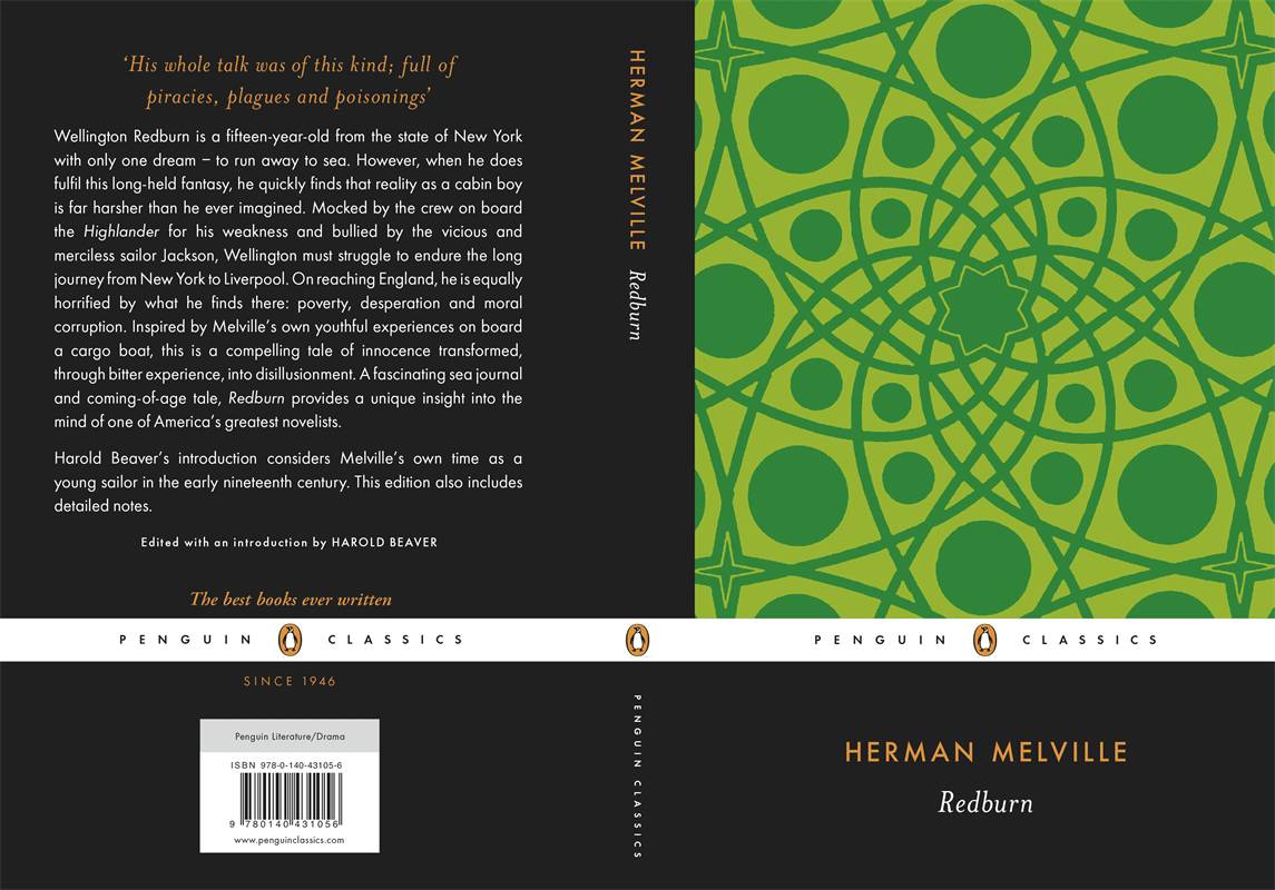
..while the non-modern Classics get various abstract patterns.


The most recent series of these resurrected books I have encountered is The House of Books, from Australian publisher Allen & Unwin. They also use various abstract patterns, but the visual effect is quite pleasing. My only complaint about these is that they've got the text as a digital file for the ebook versions, so I assume it's only money-saving that has led to some of the printed books using horribly tiny type photostatted from old paperbacks, instead of nicely set new layouts.