
As the margins shrink on printed books and the ebook market grows, more and more backlist titles will end up in these printed-as-POD-only ghettos, with little in the way of title-specific design. Instead, almost all of these imprints have a series 'look', with minimal differences between the covers other than author and title details. Because of this, I think it's worth having a look at what the future holds.
* * *
First up is Faber Finds, previously discussed here. Initially each book had its own randomly generated pattern on the front, the colour of the pattern indicating the genre (red=fiction, blue=general non-fiction, green=children, etc).


[As an aside, that John Bowen book, The Centre of the Green, a 1950s domestic/social comedy, has a great exchange when a retired military man decides to take up reading fiction:
The Colonel did not intend to be defeated by a work of fiction, and having begun, persevered with it. "Going to take me a long time to get through, though," he said. "All this detail! What imaginations these chaps have, eh?"
"How far have you got?"
"Nineteen hundred and ten."
"Cheer up. You're bound to lose a lot of characters in the war."
"More chaps'll get born though," the Colonel said. "You see if they don't."]
More recently the series has had an overhaul, with a sleeker, quieter look; the stripe under the author name fulfills the same colour-for-genre function. (And the books no longer seem to have the OCR-induced typos that plagues some of the earlier titles.)


Next we have the Gollancz SF Gateway, an ebook-only imprint of hundreds and hundreds of old SF and fantasy works, some wonderful and some justly neglected, which make use of the traditional glaring yellow covers Victor Gollancz books were known for in the past. The SF books get chunky capitals, while the fantasy novels get a community-newsletter fancypants script.


Next is the Bloomsbury Reader collection, which started as Bloomsbury's old ebook range and is now expanding into startlingly expensive POD editions. Each cover gets a standard patttern of repeating logos, with different writers getting different colours.


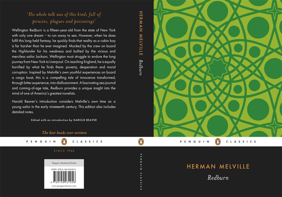
Penguin Classics UK has a few of their books as PODs only. The Penguin Modern Classics have the startlingly minimalist look I complained about here...


..while the non-modern Classics get various abstract patterns.


The most recent series of these resurrected books I have encountered is The House of Books, from Australian publisher Allen & Unwin. They also use various abstract patterns, but the visual effect is quite pleasing. My only complaint about these is that they've got the text as a digital file for the ebook versions, so I assume it's only money-saving that has led to some of the printed books using horribly tiny type photostatted from old paperbacks, instead of nicely set new layouts.


5 comments:
I do love that old books are becoming available, but for a lot of them a secondhand copy would only be £1 or £2. E.M. Delafield is a good case - some of them, like No One Now Will Know, are very difficult to find secondhand - whereas Thank Heaven Fasting is very easy to find. But same price ebook. Huh.
I do like the patterns of The House of Books covers - they seem to have some effort put into them!
the vast majority of these are abysmal. just because it's an eBook, doesn't mean it shouldn't have a good jacket. in fact, with the way screens are, they should be just as nice as the paper version. what a shame.
StuckInABook, I agree: you're almost always better off getting a 2nd-hand copy if you can, but I have bought the Delafields that were never republished by Virago.
Rebecca: You're right--though you can at least use Calibre to change the cover of an ebook to an old, classy one.
As much as I love the world of cover design, I must say, my OCD mind finds standard covers kind of satisfying. I think the Bloomsbury ones are the least attractive. I love the AU ones, but find their logo really ruins the impact of the designs.
The Au definitely are the best. The logo doesn't bother me, but it is pretty large.
Post a Comment