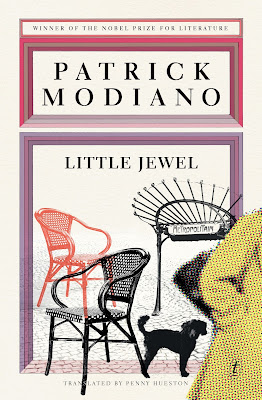
What's interesting is the uniformity of cover design, despite these books being put out by very different firms. Basically, everyone seems to have decided that for Modiano, moody monochrome photos are the way to go.
From Bloomsbury UK:
From the Margellos World Republic of Letters series, and from Verba Mundi (both of whom were commendably publishing Modiano before the Nobel win):
From New York Review Books (forthcoming next year):
From Bloomsbury US:
Even the publishers who did things a little differently still made use of monochrome illustrations (plus spots of reds, blues and purples) in a way that maintains the same atmosphere as the other covers above.
Text Publishing:
MacLehose Press:
And, perhaps the most distinct, Houghton Mifflin Harcourt:


3 comments:
That's funny. These are the Danish covers, published right after he won the prize: http://danskbogdesign.dk/forfatter/patrick-modiano/
thanks for that link. they fit with the Text covers most.
I just saw your Mr Penumbra cover: beautiful!
Post a Comment