
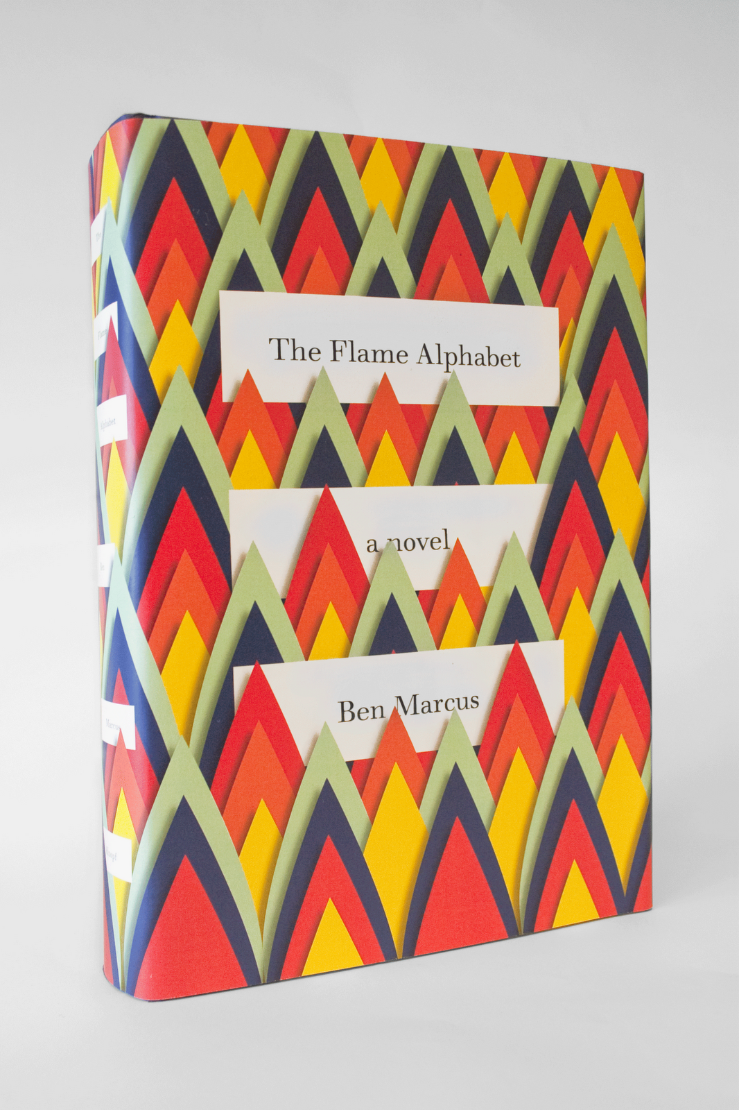
I have no idea if this is the actual final cover (the book's not out until January), whether Peter was the designer, or how many layers of jacket were required to create that effect, but I love it and want it NOW!
(For my interview with Peter, see here.)
Amazing! (and thanks for linking back to that interview, which I had not read before)
ReplyDeleteMy guess(es): This is the final cover. Peter is the designer or he would have credited someone. The flames are actually flat and will be printed. I assume it was a paper cutout or computer generated but influenced by paper art like this: http://fun-pak.blogspot.com/2011/02/beautifull-paper-art.html
ReplyDeleteIf it was layers of "jacket" that would be a great little art piece, but highly impractical as a jacket. Paper cut central...
But what an absolutely satisfying and fresh visual solution. Only Peter. Still don't know of ANY cover of his that I would not like to own and put in a friggin' display box.
I know--sometimes it's hard not just to repost everything from various designers' blogs.
ReplyDeleteThis book looks fantastic.I hope you would give some review on book covers that really have some tactile effects such as Maggie Harvest's embroidered cook book.
ReplyDeleteThe underside of those recent Penguin covers by jillian tamaki is also apparently printed and looks like this (if it were stitched in real life like the Maggie Harvest's cookbook that would be simply off the hook—and blood near impossible technically and expensive as hell!):
ReplyDeletehttp://farm6.static.flickr.com/5302/5638390279_e25c4bb1e1.jpg
http://farm6.static.flickr.com/5148/5638967304_579e4c4e5a.jpg
http://farm6.static.flickr.com/5146/5638966220_19530a437b.jpg
Paul says:
"i had the good sense to lift the backing off of jillian's image, and eureka moment - these must be the inside front covers, in reverse. luckily the keepers of the purse strings agreed."
Am I cynical for thinking this cover is probably intended to distract from a mediocre book? Or that those little pieces of paper will get all bent to hell within a week of owning the book?
ReplyDeleteI could be wrong but looking at the spine the "layers" may all be one flat printed surface.
ReplyDeleteChris: Looks like you're right. Now I feel stupid. :)
ReplyDeleteYes, I was fooled too--it's very cunningly photographed, I think.
ReplyDeleteIan: That's a great idea about printing the backing. Paul Buckley knows what he's doing.
Great cover! What a lovely effect.
ReplyDeletehave you seen this coocbook series? very lovely: http://www.a-littlebird.com/2011/07/28/prize-draw-three-moro-cookbooks/
ReplyDeleteWow, those are really nice--I hadn't seen them before.
ReplyDelete