Having recently posted the beautiful type-dominated covers for Vintage Classics' Italo Calvino and Raymond Carver reissues, I had to interview the man responsible, Michael Salu. He was kind enough to agree, so here we go... (and remember to visit his site, With Subtitle, which has mountains more beautiful design work)
* * *
CAUSTIC COVER CRITIC: What's your design background? How did you get into book design?
MICHAEL SALU: Teenage obstinacy led me to snub a burgeoning literary ability (lauded by my teachers at the time), and embark on a career in art and design. I eventually gained a degree in Graphic Communication, which had a quite varied curriculum, helping to articulate my inclination for more lateral thought. I had influential tutors who exposed me both to the fundamentals of typography and how to be an unemployable socialist.
CCC: Are you on staff at Random House/Vintage, or are you a freelancer?
MICHAEL SALU: I used to work for the literary division of the Random House Group. I've now moved on to be Artistic Director of Granta magazine. It was quite rewarding working specifically for the literary division as I often worked on books I had a personal interest in, allowing me to maintain a design-led approach. 'Design-led' might appear to be an odd thing to say, but vast swathes of the UK publishing industry, have a tendency to overlook this.
CCC: What are some recent covers of which you're most proud? What about older work?
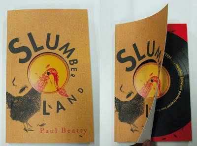
MICHAEL SALU: Actually a lot of my favourite covers had limited exposure, a consequence of small print runs and distribution territory. I particularly enjoyed working with the Harvill imprint. One such cover was for Slumberland by Paul Beatty, which featured a 12inch-like die cut and a GDR influenced aesthetic.
Vintage Classics allowed me a lot of freedom. I was quite pleased with the Raymond Carver series, as I tried to capture Carver's paired down aesthetic with a minimal treatment of the gorgeous Bodoni typeface. The Marcel Proust covers--also for Vintage Classics--were quite successful. Proust's writing is intricate, delicately woven but above all romantic. Penny Cottee's photographs encapsulated the metaphor beautifully.
The Bruce Chatwin series I designed a couple of years ago was a particular favourite of mine. I'm still surprised I got away with it. Horizontal lines playing at landscapes and atmosphere...
CCC: How much do you work with a computer, as opposed to old-fashioned ink/paint on paper? And with images like your Tricky portrait (shapes cut from plywood(?), photographed with real smoke behind it), is the pressure or temptation there to do it quickly in Photoshop, rather than making and photographing a real, physical object?
MICHAEL SALU: This is something I'm particularly vehement about. Bizarrely, designers looking for employment are often judged by what software they're able to use. Intellect, cultural awareness and often creativity don't seem to be values worthy of a resume. There is no substitute for good ideas, the rest are just supportive tools. I have always been quite a craft-led designer, but I am of the generation that studied with a mac in front of them and I think its good to understand the importance of both. The 'Maxinquaye' artwork was a good example. I probably could have mimicked smoke in Photoshop, but regardless of any pen tool dexterity, it would still have looked obviously computer generated. Getting my hands dirty with help from a hot kettle, plywood, spray paint, cigarette smoke, daylight and my good friend, photographer Giles Jenkyn, made for a much more authentic solution. The mercurial nature of light and smoke can't really be replicated...
The album image (above) and the studio set-up to create it (below)
CCC: Is it a hard sell to get a type-only cover accepted by a publisher?
MICHAEL SALU: Yes. Particularly with the publishing industry under immense pressure, in a bid to cope with 21st century's democratisation of information. To Random House's credit, they often agreed to type-only suggestions if narrative or concept were explicit enough. I love immediacy in design. To convey an idea concisely, with as little fluff as possible is quite pleasurable.
CCC: Your Highsmith covers fit nicely with Nathan Burton's Highsmiths for Bloomsbury--was this deliberate?
MICHAEL SALU: Not particularly, more coincidental than anything else. Sometimes deconstructing the brief from an editor can be a challenge in itself, particularly if they request something Saul Bass-esque. You can probably imagine the chorus of groans. Hmm… how can we do something reasonably interesting with a nod to one of the most iconic and influential designers of our time? Myself and fellow designer Liam Relph worked on this series together. The approach was inevitably Bass-influenced, but Liam and I are both keen on narrative illustration anyway. The covers were all hand drawn with double-hit pantone colours on uncoated paper.
CCC: If you could design, inside and out, without budget limitations, any book from the history of literature, what would it be?
MICHAEL SALU: I've been lucky enough to work on some of my favourite books like The Brothers Kamarazov, and a selection of Kurt Vonnegut's books (albeit with very limited budget), but if offered such an opportunity I would love to design Dante's Inferno. Imagine what could be done with the Nine Circles of Hell if money was no object!
CCC: Is there any neglected book you'd love to draw to people's attention as something they should seek out?
MICHAEL SALU: There's a long neglected book you may vaguely recall, called The Bible. I'm not religious but it does make a good read, although I'm not sure its still in print. Alternatively I was introduced to Lost Illusions by Honore De Balzac a while ago and it is a true (and still hugely relevant) classic.
CCC: Thank you, Mr Salu!


4 comments:
Oh I love those Prouse botanical covers. Never had the confidence to read him, although my dad has.
Beautiful covers and great interview. I so agree with Michael's views on editorial design!
Those excellent covers are spoiled for me by the way "Vintage" is splashed across the top - way too intrusive. I can't think of another publisher that prints its name as big as the author's: it looks arrogant. Why not use the perfectly acceptable old Vintage logo? Or just whack "Vintage" off into a more remote corner.
It's a bit of a bugger--and it doesn't help that the author's first name is always excluded, so that for lesser-known writers you're left thinking 'Who?', or those with common surnames (like Dodie Smith) just end up as VINTAGE SMITH, which isn't very helpful.
Post a Comment