Wednesday, 10 December 2014

Fluffy

Here's an inspired approach to creating a limited-edition version of a book. Commendably angry publishers OR Books recently published a collection of noted awful film-maker Ed Wood's pulp short stories, Blood Spatters Quickly.


Among many other notable traits, Wood was also a cross-dresser, particularly obsessed with wearing fluffy pink angora jumpers (or 'sweaters', for the Americans in the audience)--see his early movie Glen or Glenda, which heavily fictionalised his own experiences and in which he played the lead...


..and so it's rather wonderful that the special edition of this book comes with its own fluffy pink jumper.


What are the stories like? Pretty much as you might imagine, only even more mad and padded and inept. As an example, the opener, Scream Your Bloody Head Off, which is accompanied by this entirely apt bit of artwork...


..begins like this:

'She was going to send him to the cemetery. He knew that from the moment he saw her flying at him, that knife gleaming over her head.

'It was bitter cold and the blizzard had been grinding across the land for more than two days and there didn’t appear to be any letting up and Stella, Johnnie’s wife, lay dead on the kitchen floor… right where she had fallen dead from the butcher knife wound in her heart – the night the storm had started.

'Sure, Johnnie had screwed the neighbor broad right through. Stella had been so right about that. But he couldn’t figure why she came charging at him with that foot-long butcher knife. She had flown across the kitchen floor at him screaming her bloody head off… screaming like a wounded eagle. She was screaming as if all the devils of hell, the creatures from the grave, had entered her very being. It was not even her own voice. She had screamed at him before… many times before… but there was never the sound of panic, despair, horror in those tones… if the sounds could even be called tones.

'All he remembered about that moment, except the terrifying utterances that gaping mouth made, was that gleaming butcher knife, raised so high above her head and it was coming in his direction… the high-pitched scream… the gaping mouth… the saliva-dripping tongue and lips… the red… bloodshot red eyes which suddenly seemed to have no eyelids… simply blood-red eyes in dark sockets… never blinking…and that black negligee trailing out behind her like sheer bat wings on a heavy breeze.'

Wednesday, 19 November 2014

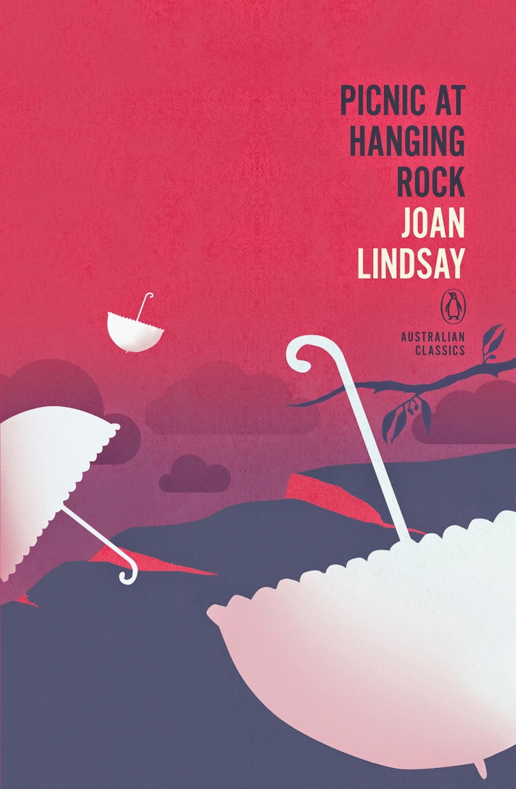
Penguin Australian Classics

As my country stumbles dickheadedly into the shitbin, a population of bigots and morons led by a government of mendacious and vindictive arseholes, it's nice to have one small positive to note: the design of the Penguin Australian Classics series. This (supposedly ongoing) series of smallish hardbacks have their cover designs printed directly onto the boards.

Designed by Adam Laszczuk, with illustration by Josh Durham, they make use of fields of flat (yet lightly weathered or textured) colour and sharp-edged illustrative elements. Click on each image for much, much bigger versions.


Note that all of these books were already in print from Penguin Australia, some as Penguin Modern Classics: I hope future entries in the series will rescue out-of-print titles from oblivion, as does the sterling Text Classics series.

Broadview Shakespeare

Canadian academic publisher Broadview has a strong line of classics, including a number not available elsewhere. It's just a shame that their books, while usually featuring well-chosen images, have a slightly fusty, clunky style to the designs:


So it was a positive pleasure to come across the redesign of their Shakespeare series. In a style reminiscent of Melville House's Neversink Library (single-colour background, well-chosen silhouettes), they also deploy well-chosen quotes from the plays in nice, big text. The design work is by Michel Vrana (who also did the Thomas Berger covers in this post)..


The choice of silhouettes that that are metaphorical (lion) or even jokey (the pursuing bear) add to the cleverness.

Saturday, 25 October 2014

Small Publisher Specials #1: Readux

Being the first in a series of posts focusing on the splendid work of small publishers in this small-publisher-unfiendly age.

*

Readux is a small publisher in both senses of the word--they are a small Berlin-based outfit, but they also publish small (32, 48 or 64-page) books: novellas, short stories and essays, either in the original English or else translated from Swedish or German. These are not little stapled booklets, either: they're proper, perfect-bound books.

Usually published in batches of four, three times a year, each Readux series has a specific look, unified by the overall design of Susann Stefanizen.

Series 1 makes use of surrealistic illustrations by AndrĂ© Gottschalk, full of flat colour and strange elements.


Series 2, all Stefanizen's work, are more abstract, with coloured polygons on textured backdrops.


The most recent series, #3, uses delicate pencil sketches by Lisa Schweizer against worn paper backgrounds.


And then there's the imminent series 4, all eye-warping patterns and neon colours, designed by André Gottschalk and Susanne Stahl, based on their 'See Before Reading' system...


Returning to Susann Stefanizen, here are her beautifully simple geometrical designs for a series of German-published books on music...